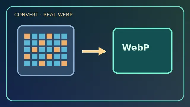
Convert privately
Use local Canvas encoding, then verify the output is WebP rather than assuming the browser supports it.
NEW TOOL · RELEASE ASSETLAB-20261023-01 · NO ACCOUNT
Compress and resize images to actual WebP files in your own browser. Inspect file size, preview each variant, download responsive images, and copy accessible HTML. No uploads, accounts, analytics or external processing.
Use local Canvas encoding, then verify the output is WebP rather than assuming the browser supports it.
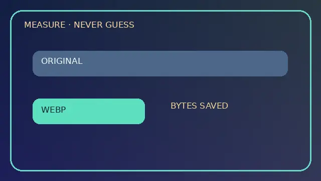
Compare the actual input and encoded byte counts. An output can be larger; the tool shows that rather than claiming savings.
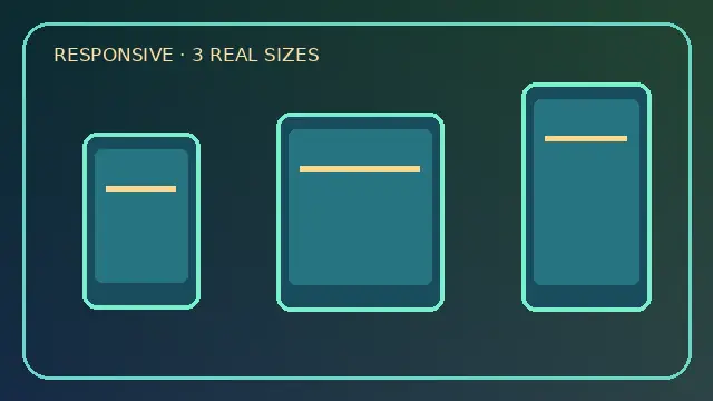
Create real width variants and a matching srcset. Use a suitable sizes value for your page layout.
You can also drop up to 8 files here. Max 20 MB per file, max 16 megapixels. Animated images are not supported as animations.
Lower quality may reduce bytes but introduces artifacts.
No upscaling; duplicate dimensions are skipped.
Ready. Files never leave this browser.
Choose images, then press Create WebP variants.
Each note addresses a distinct publishing decision. Sources below are documentation references, not performance guarantees.
Canvas toBlob may silently return PNG if the requested format is unsupported. Inspect the returned Blob type before naming a file .webp; this tool refuses a mismatched result.
Source: MDN Canvas toBlobCompare byte counts, not file extensions. A low-complexity PNG can be smaller than a high-quality WebP. If the result grows, try a smaller dimension or different quality and inspect sharp edges.
Source: MDN encoder qualityStart with the CSS display width on phones, tablets and desktop, then account for device pixel density. Generating enormous images for a 300px card wastes bandwidth.
Source: MDN img sizesEvery width descriptor in srcset must match the real pixel width of that specific file. Do not label a 640px image as 1280w. This tool derives descriptors from canvas output dimensions.
Source: MDN srcsetSizes tells the browser how wide the image is expected to display at each viewport width. The generated snippet is a starting point; adjust breakpoints to your CSS grid and content column.
Source: MDN sizesDeclare width and height or a matching aspect ratio. Without reserved space, text can jump when a late image loads, degrading readability and interaction.
Source: MDN img width and heightDescribe the image's purpose in context, not a list of search keywords. Decorative images can use empty alt text. This tool never fabricates alt text from a filename.
Source: MDN alt attributeThe image likely to be the page's main visual should normally be discoverable early. Use lazy loading for images farther down the page, and verify the result with actual browser measurements.
Source: MDN loading attributeHigh priority is useful for a truly important above-the-fold image, but making every image high priority defeats the signal. Start with the likely LCP image and test.
Source: MDN fetchpriorityWhen a mobile crop conveys different information than a desktop crop, a picture element can select sources by media query. Keep a suitable img fallback and meaningful alt text.
Source: MDN pictureBrowser-side conversion processes only the selected image pixels. Test downloaded images on your actual target devices. EXIF metadata may not survive canvas re-encoding. This is a standalone tool, not a cloud file store.